This newsletter should have gone out yesterday evening but this, that, the other, and well, there went the weekend. So — a quick tour of what I was doing last week.
At the day job, I started compiling our team’s monthly status report. It’s the grandaddy deliverable for our contract and requires me to compile many separate weekly meeting notes, about 12-15 individual reports, and multiple other sources, pour it all into a template, and then smooth it all out so it at least reads coherently (though we all know, secretly, that no one will actually read it) (they’d rather wait for the movie).
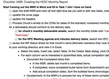
I keep a long Evernote checklist that covers in minute detail every step I take to pull that wodge of material together. Checking off each detail helps me see at a glance what still needs to be done. But the checklist also includes URLs, internal Evernote links, and shortcuts to files or directories I need to refer to.

This is about a third of my master checklist for compiling a monthly report.
I read somewhere that the best knowledge management tool was a checklist; it holds the results of your lessons learned so you don’t have to solve the same problem over and over.
I’m always updating this checklist and trying to find ways to shave a few more minutes off the compile time.
I have not created detailed checklists to help me compile this newsletter or the Bull City Commons newsletter, though I should.
This week, though, I spent hours to save minutes, which is one cynical but sometimes accurate definition of productivity.
One problem I have with the newsletters is resizing large photographs or images so they fit within the dimensions of the Mailchimp template (for BCC) or Substack (for this newsletter). Having to stop for each large image, open an app, resize the image, save it with a new name, close the app, discover the image is still too large, reopen the app, re-resize, etc. TEDIOUS and it interrupts the slow drip of my fickle creativity.
Fortunately, I use an iMac and I know about a built-in macro tool called Automator. I spent a couple of evenings researching Automator workflows for resizing images and implemented a few. (Here’s one example.)
My image resizing process is now a matter of right-clicking an image, selecting a menu option to reduce the image by 50% or a specific pixel width, and bah-dah-bing, there it is. I do love geeking out on stuff like this.

The behind-the-scenes Automator workflow that reduces an image by 50% and changes the filename.
I also successfully broke the 200-pound barrier this week, weighing in at 199.8 — this milestone took its time arriving but we got there.
I prefer tracking my weight using a sheet of graph paper, a pen, and my scales.
This image shows my graph for losing 5 pounds over the course of about 5 weeks; a pound a week is considered a safe rate of loss. I started at about 205 lbs on January 6 and hit 199.8 on February 6.

I’ve described elsewhere the gory details on creating this type of chart if you’re interested in the whys and wherefores.
But then, whoops, we went out to Pomodoro Italian Restaurant with Jim and Maria on the 7th, then Thai Cafe on the 8th, then free popcorn at Carolina Theatre’s Fan Appreciation Day, and well — up the weight goes!
Which is why I care/don’t care about weight. It will go up 5 lbs due to the high sodium content of a meal and then back down to normal two days later. Weight is a lagging indicator. But you can see from my graph above, despite the ups and downs and plateaus — plus the fact I relax my eating rules on the weekends — there is still a discernible downward trend.
But weight isn’t my only measure. This is the other and a merciless one at that:

The Perfect Waist Tape Measure (Amazon)
As health blogger CriticalMAS says:
The scale might lie (in the short term), but the tape measure doesn’t.
Although I’m 6’3”, my waist is about 40 inches, which is about 4 inches too much for my build. My weight chart shows steady loss, which is good and fine, but I haven’t yet started to lose the inches I need to lose to improve my health markers.
So, as an acquaintance of mine used to say: “Onward and downward.”
Checklists, graphs, tape measures, workflows — I sound like an awful drudge, don’t I? But one can’t help what one is drawn to.
So to go out on a lighter note for the word-nerds out there:
Contronyms — also called auto-antonyms — are words with multiple meanings that contradict each other. So, “overlook” can mean both “supervise” and “ignore”. “Fast” can mean “fixed in place” or “moving quickly.” Here’s a list of 75 contronyms and of course Wikipedia has the pedantic details.
Palindromes, as you know, are sequences of characters that read the same backward and forward. “Taco cat” is a palindrome as was a recent date in February: “02/02/2020.” Here’s a short list of some cute palindromes.
I’m Michael E. Brown. One of my goals with my website and this newsletter is to keep in touch with friends and correspondents. So if you have any feedback, please send it along!
This was issue #0010 of Learning As I Go for February 10, 2020. It is published on the 2nd and 4th Sundays of the month (usually, sometimes, but not today).

